
There are different colour harmonies such as primary, complementary and analogous. these can affect how the colours are perceived in comparison to each other. for example complementary colours with be opposite from one another such as red and green, so the saturation of them will be more noticeable. however combinations following an analogous colour combination will have less range in hue and be three colours next to each other on the colour wheel, such as green yellow and orange.
There are two sets of primary colours red yellow blue and yellow magenta and cyan. using RGB is an additive way of mixing colour, it is used with light so starting with black and adding colours to eventually get white. CMY colours are more commonly used in art since it is a subtractive mixing model, you are able to achieve majority of colours from this limited palette.
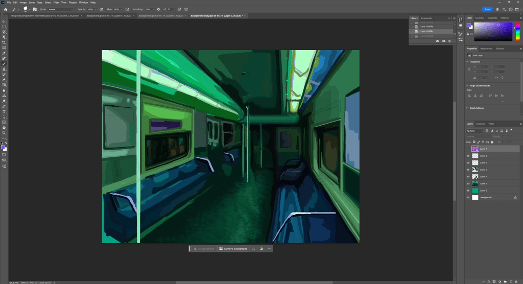
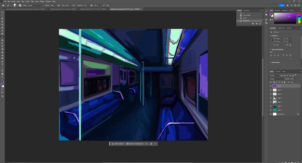
I used an overlay to change the colour of my work. I tried every colour and found purple looked the best and complemented the colour underneath the nicest. However I think a lot of the values where lost since the green and purple mixing with each other made the whole image darker. Even though purple and green arn’t exactly complementary they are far enough on the colour wheel to somewhat cancel each other out. this is why this combination is different from a lot of the others since they made the image brighter, leading to loss in values.
